While The Connoisseurs celebrate Christmas, we know you may or may not, so here's a big, heartfelt "Happy Holidays" to you.
Santa brought Shay a new flex pen, and Nick, well, he pretty much got shafted.
Our families, however, were very kind and generous.
We are taking a bit of time off to celebrate with them, and enjoy each other and the dogs' company.
Merry Christmas to all, and to all a good night!
Also, Happy 2011! Can you believe it?!?!?!

Saturday, December 25, 2010
Wednesday, December 15, 2010
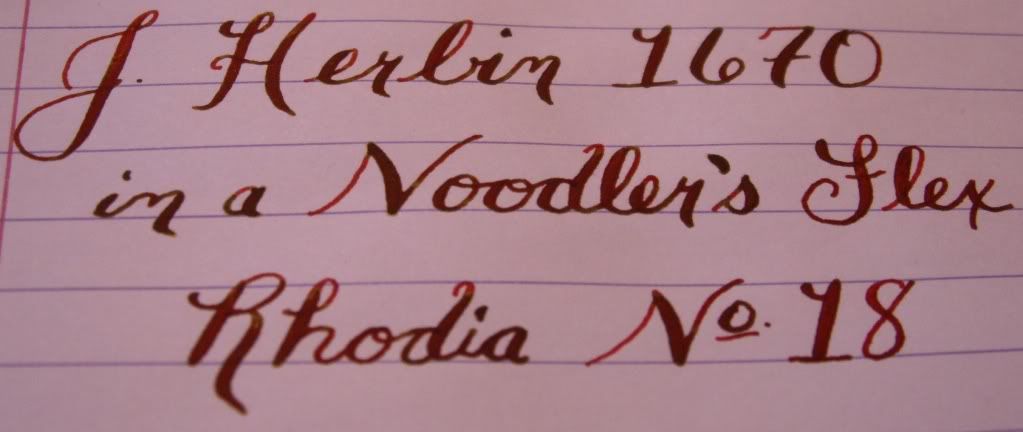
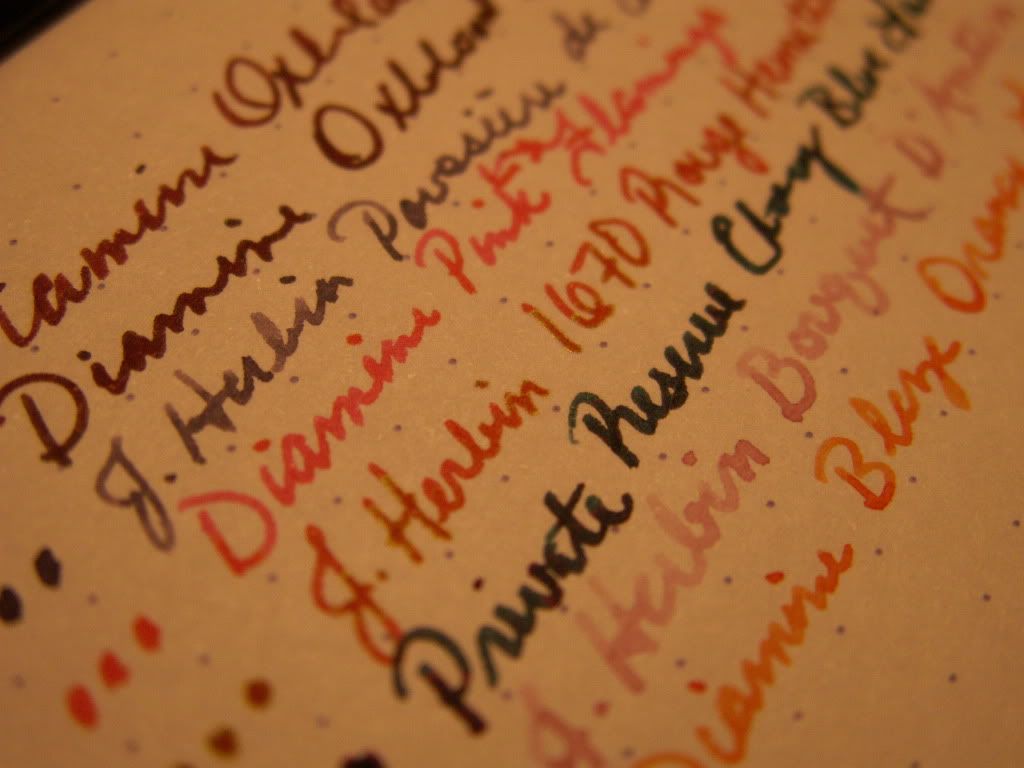
Noodler's Flex Pen, AND Noodler's Black Swan in Australian Roses Ink
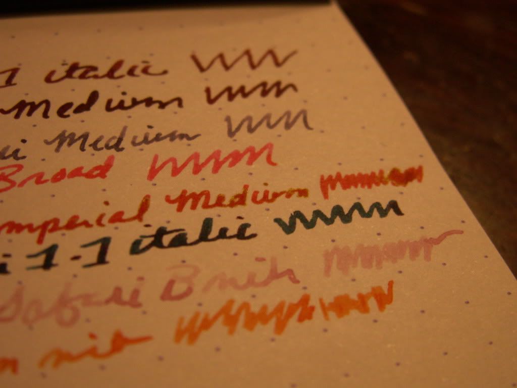
Well I can honestly say that I am thrilled with the new Noodler's Flex Nib Pen. The first time I filled it, I put the newest ink offering from Noodler's, Black Swan in Australian Roses in. Using this pen to the maximum potential took some getting used to, but WOW! I still cannot say that I know what I am doing, but the learning curve with this pen isn't bad at all. This is the first time I have ever used a flex nib, and the experience has been more than rewarding.
I wrote my review the first night I had the pen, so it is not the greatest representation of what this pen is capable of. On the other hand, I feel like this pen is kind of intended for folks who don't have a lot of experience with Flex pens, so an honest portrayal of what things are like starting out is fitting. I wasn't sure if I would like a flex nib or not. I did not want to have to alter my writing to fit one pen. I do feel that this pen can be used reasonably without having to slow down so much that it makes letter-writing or journaling a pain. When you do slow down though, oh my! The line variation between flexed and un-flexed just looks outstanding. While we here at The Poor Connoisseurs are indeed poor, I didn't feel too terrible chancing $14 on a pen I wasn't sure if I would like. Having tried it now, $14 is an ABSOLUTE STEAL! This has pretty much become my favorite pen, although my dear Sheaffer is still amazing. People seem to either love this pen or are completely unimpressed. Count me in with the former crowd. The nib does give a "rail roading" effect when it is fully flexed and moves too quickly. As I have learned to use it more, this has lessened, but I don't really mind it, and I think the effect looks cool.
The Flex pen is a piston filler, and it was also my first experience with that type of filling system. I was quite content with my cartridge/converter fill pens, because they are easy to refill and clean using the Private Reserve Syringe kit. I was not looking forward to empty/fill with water/rinse/repeat schtick to clean this Noodler's pen. I did my first routine last night, and I was pleasantly surprised! The pen came clean without too much hassle, and the nib and feed were also very easy to remove, which sped things along nicely.
I have since refilled with J. Herbin 1670, and that ink looks stunning as well. I did have a problem starting it up today, so how big of an issue that is remains to be seen. I never had a problem with Black Swan.
Which brings me to the ink! It is also a very nice offering from Noodler's! From what I gather, the intent with this ink was to shade like crazy, and that it does. This ink goes from a very dark, almost black color, to dark purple, then burgundy, then mauve. The effects with the Noodler's Flex pen are just epic. On the really dark, wet strokes, the ink does feather just a bit (even on Rhodia), but you don't really notice it unless you're examining very closely. This ink is not waterproof and the drying time is pretty long when very wet (we're talking minutes). In fact, I had written a card to my mother, and certain spots wouldn't dry at all. I had to carefully blot them with some cheap copy paper. Even with the slight "downfalls" of this ink, it is gorgeous, and I intend to purchase a full bottle (I initially only got a sample).
On Rhodia No. 18:

On HP 28lb. (My Goulet Invoice!)

And now a better picture, figuring out how to really use this thing:

And finally, with the J. Herbin 1670:
Photographed:
Scanned:

I recommend both the Flexy pen and Black Swan wholeheartedly, and both can be purchased from The Goulet Pen Company, if you are lucky enough to find these in stock before every one else snatches them up. =)
Many flexy returns,
Shay.
I wrote my review the first night I had the pen, so it is not the greatest representation of what this pen is capable of. On the other hand, I feel like this pen is kind of intended for folks who don't have a lot of experience with Flex pens, so an honest portrayal of what things are like starting out is fitting. I wasn't sure if I would like a flex nib or not. I did not want to have to alter my writing to fit one pen. I do feel that this pen can be used reasonably without having to slow down so much that it makes letter-writing or journaling a pain. When you do slow down though, oh my! The line variation between flexed and un-flexed just looks outstanding. While we here at The Poor Connoisseurs are indeed poor, I didn't feel too terrible chancing $14 on a pen I wasn't sure if I would like. Having tried it now, $14 is an ABSOLUTE STEAL! This has pretty much become my favorite pen, although my dear Sheaffer is still amazing. People seem to either love this pen or are completely unimpressed. Count me in with the former crowd. The nib does give a "rail roading" effect when it is fully flexed and moves too quickly. As I have learned to use it more, this has lessened, but I don't really mind it, and I think the effect looks cool.
The Flex pen is a piston filler, and it was also my first experience with that type of filling system. I was quite content with my cartridge/converter fill pens, because they are easy to refill and clean using the Private Reserve Syringe kit. I was not looking forward to empty/fill with water/rinse/repeat schtick to clean this Noodler's pen. I did my first routine last night, and I was pleasantly surprised! The pen came clean without too much hassle, and the nib and feed were also very easy to remove, which sped things along nicely.
I have since refilled with J. Herbin 1670, and that ink looks stunning as well. I did have a problem starting it up today, so how big of an issue that is remains to be seen. I never had a problem with Black Swan.
Which brings me to the ink! It is also a very nice offering from Noodler's! From what I gather, the intent with this ink was to shade like crazy, and that it does. This ink goes from a very dark, almost black color, to dark purple, then burgundy, then mauve. The effects with the Noodler's Flex pen are just epic. On the really dark, wet strokes, the ink does feather just a bit (even on Rhodia), but you don't really notice it unless you're examining very closely. This ink is not waterproof and the drying time is pretty long when very wet (we're talking minutes). In fact, I had written a card to my mother, and certain spots wouldn't dry at all. I had to carefully blot them with some cheap copy paper. Even with the slight "downfalls" of this ink, it is gorgeous, and I intend to purchase a full bottle (I initially only got a sample).
On Rhodia No. 18:

On HP 28lb. (My Goulet Invoice!)

And now a better picture, figuring out how to really use this thing:
And finally, with the J. Herbin 1670:
Photographed:
Scanned:

I recommend both the Flexy pen and Black Swan wholeheartedly, and both can be purchased from The Goulet Pen Company, if you are lucky enough to find these in stock before every one else snatches them up. =)
Many flexy returns,
Shay.
Saturday, December 11, 2010
Private Reserve Ebony Blue Fountain Pen Ink
I ordered this ink based on the rumors that it possessed a special quality. Even at the Goulet Swab Shop, you can see the rumored "red sheen". Now, I haven't quite gotten that effect very much in person, though I have gotten it to show up in SOME macro shots I have taken of this ink. I may have been disappointed in this ink because it wasn't as multi-dimensional as I had hoped, BUT... I love the color!
Most people would think "Ebony Blue" would denote a very dark blue, blue-black, or midnight blue color. I didn't find that to be the case with this ink. To me, it is a very dark teal. There is some green in this "blue", and personally, I like that. I'm a big fan of teal, but Private Reserve Blue Suede (another misnomer) is a bit too bright for me to use this time of year. Of course I say that, but I currently have Iroshizuku Tsutsuji and Noodler's Dragon's Napalm inked up, ha!
ANYWAY- This is a nice ink, despite the shyness of its red sheen. It seems a little dry in my Lamy Safari, but most inks do. It is dark enough to be used professionally, and would add a nice touch of personalization to your work. This ink screams "I am unique and came from a fountain pen". I expect that effect would be exaggerated if you could find a wet enough pen to show off the red aspect. Ebony Blue is not waterproof, but wasn't the worst performer of those I have tested.


I would most certainly recommend adding this ink to your arsenal, particularly if you are a fan of blues, greens, or blue/greens!
Shay.
Thursday, December 9, 2010
Technical Difficulties
Please stand by folks.
The Poor Connoisseurs are having technical difficulties.
Last night, the hub of our modest blog, our desktop PC, contracted computer rabies, and had to be put down.
Damn Facebook.
So, we are getting a new tower tomorrow, and hopefully I will be able to bring you more news soon. Unfortunately, I lost all of the scans I had loaded up and edited for ink reviews. This sets me back quite a bit, especially since a glass of water spilled on my desk and ruined most of my hard copies of written reviews! I also have more new inks coming in. Though they are mostly just samples, I can still review them! I don't know what I will get done first, or where to even begin really, but I promise I will be back with some substance before you know it.
Shay.
Friday, December 3, 2010
THANK YOU!
I just wanted to say "Thank You!" to my good friend Trevor for the updated graphic. Much better, methinks!
-Shay.
-Shay.
Sunday, November 28, 2010
Diamine Graphite Fountain Pen Ink: Life is only shades of grey.
This is the most "boring" ink I have. For some reason, though, I like it! Perhaps it's non-conformist nature is what entices me. It isn't black, but it's not a "color". Ooohhh, the mystery! A pen-friend wrote me with this ink, and well, I just fell in love! I purchased a bottle, but apparently Diamine had some issues with early batches of it. I got an early bottle. The suspension wasn't right, and my ink had separated into oily looking stuff and pigment, gross! So, my pen friend had sent me a sample, and that is what I used for this review. 

There's really not much to say about grey, other than I spell it with an "e" instead of an "a", because I like they way it looks better. Grey is, well, grey. This particular shade is dark enough to read, but not dark enough to be confused with black. That's what I like about it. At my desk, at night (which is when I am awake), it has just a HINT of green to it. That doesn't show up in this scan at all, so I am assuming it is just the lighting, and not the ink. The shading is pretty nice, and dry time isn't too bad. This ink did seem a little dry in my Medium-nibbed Safari, but I think it had kind of worked itself out with more use. The color seems to have darkened just a bit too.
I really like this ink, but since my bottle was wonky, I think I am going to get Noodler's Lexington Gray as an exchange. I love this ink, but I could do with just a shade or two darker. As the rain has been frequenting Cincinnati, I am also finding that I need to break down and get a waterproof ink.
*I would like to sincerely thank fellow FPN'er and pen-pal tawanda for giving me this sample!*
EDIT to add comparison pictures to Noodler's Lexington Gray.


Shay.
*I would like to sincerely thank fellow FPN'er and pen-pal tawanda for giving me this sample!*
EDIT to add comparison pictures to Noodler's Lexington Gray.


Shay.
It's Beginning to Look a Lot Like Christmas: Private Reserve Ebony Green Fountain Pen Ink
Well my friends, Shaylen Scrooge is actually feeling a bit Christmas-y this year. Given all the drama of the past few months, that in and of itself is a monumental feat. Typically, even under normal circumstances, the Holidays are a difficult time of year for me. It seems like it only reminds me of my lack of family, and finances. Alas, as 2010 rolls to a stop, I intend to Ho Ho Ho the halls with boughs of holly, or...something like that.
Anyway, in true Christmas fashion, I wanted to review this pretty green ink. I made out my Christmas cards last night, and used it for some of the personal notes I included. This is a very professional looking, well behaved ink. I know this ink has to flow exceptionally well, because the pen I am using it in has never worked for me before! It's just a crappy fountain pen from a cheap pen set, but now that it is working, it's not that bad!

It does dry pretty slowly, and is most certainly not water-proof. It's a very pretty color though, just spot-on for the rich, dark, emerald green you want for Christmas correspondence. At least, it is in my opinion. Here's a close-up of the swab:

If you're a fan of green, or looking for something to spice up your "blue or black ink only" life, I recommend this ink!
Season's Greetings,
Shay.
Wednesday, November 24, 2010
Before Fall Completely Slips Away: Diamine Blaze Orange Fountain Pen Ink
I love fall colors! Orange is especially fun because it means Halloween, pumpkins, and the Cincinnati Bengals. I'll avoid my diatribe about how the Bengals suck this year (though I'm still a fan), and skip straight to the inky commentary.
Diamine Blaze Orange is a very lovely ink! The color is a very nice bright orange. This one doesn't lean too much toward yellow, red, or brown, and stays a true clean orange. The shading is quite noticeable and very pleasant. This ink would probably be too light for some people's tastes, and simply just "too loud" for others. I think it is quite readable, but you certainly couldn't use it for much besides personal correspondence or journaling. You might even be able to get away with using this as a highlighter ink, but I haven't tested that theory. It is not supersaturated, but it is very vivid. I really like this ink!!!


Happy Thanksgiving,
Shay.
Tuesday, November 23, 2010
Quick word
I am hoping to get some new reviews up soon. Some of you may know, others may not, but our little boy Bosco had to have knee surgery and get neutered this past Friday. He is doing well, but keeping him calm is a full time job- with mandatory overtime. That, coupled with two family Thanksgiving celebrations this week mean very little free time. Fear not, dear readers, I have not forgotten ye, I have just been busy with things that are slightly more important.
Shay.
Shay.
Wednesday, November 17, 2010
Another "Blood Red" Ink: J. Herbin 1670 340th Anniversary
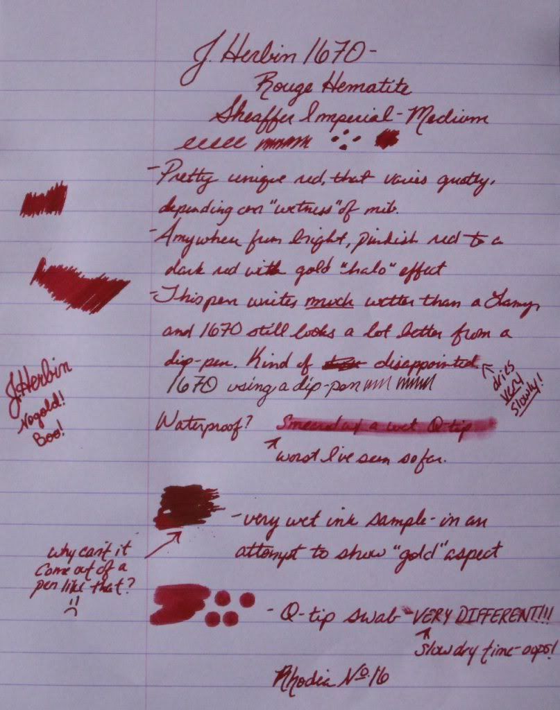
So this ink is (as far as anyone knows) only to be produced in 2010, as J. Herbin celebrates their 340th anniversary. You never would have guessed that from my title, would you? J. Herbin is a French, world-renowned ink and wax producer that has been around for, well, 340 years. This ink is also known as Rouge Hematite, citing a blood-red coloring.
I had very high hopes for this ink, and while they weren't completely dashed, they weren't fulfilled either. You see, this here ink has some gold in it... not real gold, per se, but metallic gold flecks/specks/particles. THAT is what makes this ink so interesting to me. Otherwise, it would just be red. Well, I had heard reports that these little gold beasties don't make their way onto paper, and not to count on that. On the contrary, I had seen many examples online of ink with the gold "halo" effect front and center. What was I to do? Not get any and later regret it when it is no longer available? Pish-posh!
So, I bit the bullet and anteed up the $22 I paid for 50mls of this stuff. Too much? Yes, but not by a lot, considering it may no longer be produced in a month or so.
I loaded this stuff into a Safari (with 1.1, 1.5, B, and M nibs)...and no gold. Curses! A dip pen tells another story. The red was much more dark and prettier, and the gold could be seen! I don't really like writing with dip pens though. Le sigh.
A few days after I got this ink, I got my Sheaffer Imperial in the mail. WOW- does this thing put down a lot of ink! I now had a little bit of restored hope that I could get the gold to flow from a fountain pen nib. So, yesterday, I loaded the 1670 up in the Sheaffer. It was mediocre at best. No really apparent gold. It might be there, if you squint a lot, and it was a really wet stroke of ink. Maybe. This next photo proves I am not crazy, that there is some "gold" there... it just isn't coming out of a fountain pen nib.
The ink is fine to write with. It flows smoothly, doesn't feather, or bleed-through. But honestly, from a fountain pen (or at least the ones I have) it is just red. Not even a pretty red like Diamine Oxblood; just plain ol' red. It dries really slowly, and is super saturated. It is not waterproof at all, but I don't think anyone expected it to be.

Now- it was dark outside when I prepared this review, and my scanner has been crappy as of late, so this is the best I could do for getting a picture. You get the gist, though. Besides, any of you who care about this have probably seen a million other examples of this ink. I do believe that it is worth noting that the dip pen sample in the above picture does show what I wanted this ink to look like. The gold almost gives it a greenish cast.
So- do I love it? No.
Do I hate it? No.
Would I buy it again? Probably not, especially for $20-$22.
Well, do you regret buying it, Shaylen? Not really. I will probably only use it for "love letters" written with a dip pen, but the hoarder in me is glad I got some while I had the chance.
Edit: Added more pictures, more "gold" evidence, and a picture actually taken during the day.
Another Edit to add one more picture of this elusive gold:

-Shay.
I had very high hopes for this ink, and while they weren't completely dashed, they weren't fulfilled either. You see, this here ink has some gold in it... not real gold, per se, but metallic gold flecks/specks/particles. THAT is what makes this ink so interesting to me. Otherwise, it would just be red. Well, I had heard reports that these little gold beasties don't make their way onto paper, and not to count on that. On the contrary, I had seen many examples online of ink with the gold "halo" effect front and center. What was I to do? Not get any and later regret it when it is no longer available? Pish-posh!
So, I bit the bullet and anteed up the $22 I paid for 50mls of this stuff. Too much? Yes, but not by a lot, considering it may no longer be produced in a month or so.
I loaded this stuff into a Safari (with 1.1, 1.5, B, and M nibs)...and no gold. Curses! A dip pen tells another story. The red was much more dark and prettier, and the gold could be seen! I don't really like writing with dip pens though. Le sigh.
A few days after I got this ink, I got my Sheaffer Imperial in the mail. WOW- does this thing put down a lot of ink! I now had a little bit of restored hope that I could get the gold to flow from a fountain pen nib. So, yesterday, I loaded the 1670 up in the Sheaffer. It was mediocre at best. No really apparent gold. It might be there, if you squint a lot, and it was a really wet stroke of ink. Maybe. This next photo proves I am not crazy, that there is some "gold" there... it just isn't coming out of a fountain pen nib.

The ink is fine to write with. It flows smoothly, doesn't feather, or bleed-through. But honestly, from a fountain pen (or at least the ones I have) it is just red. Not even a pretty red like Diamine Oxblood; just plain ol' red. It dries really slowly, and is super saturated. It is not waterproof at all, but I don't think anyone expected it to be.

Now- it was dark outside when I prepared this review, and my scanner has been crappy as of late, so this is the best I could do for getting a picture. You get the gist, though. Besides, any of you who care about this have probably seen a million other examples of this ink. I do believe that it is worth noting that the dip pen sample in the above picture does show what I wanted this ink to look like. The gold almost gives it a greenish cast.
So- do I love it? No.
Do I hate it? No.
Would I buy it again? Probably not, especially for $20-$22.
Well, do you regret buying it, Shaylen? Not really. I will probably only use it for "love letters" written with a dip pen, but the hoarder in me is glad I got some while I had the chance.
Edit: Added more pictures, more "gold" evidence, and a picture actually taken during the day.
Another Edit to add one more picture of this elusive gold:

-Shay.
Tuesday, November 16, 2010
Diamine Oxblood Fountain Pen Ink
This ink is exactly what I wanted it to be. It is currently my favorite, and even though I have plenty of new offerings waiting in the wings, I've inked up with Oxblood twice in a row. I was lucky enough to have a friend send me a written sample of this ink before purchasing it, so that I could see it in person. I am so in love with the color, it looks just like fresh, oxygenated blood. It is an absolutely gorgeous dark red, great for Fall and the Holiday Season. There is enough "blue" to this to make it a brilliant, true red, and keep it from leaning towards brown. There's also not so much blue that this leans toward burgundy or purple.
Flow is very good with this ink, especially in the Sheaffer Imperial I put it in today. There is no feathering or bleed-through in a Lamy Safari 1.1 italic nib, but my medium Sheaffer nib is so wet that it does feather very slightly on Rhodia. Dry time is not great, but not really much worse than any other ink I've used. Waterproof-ness is on par for a non-waterproof ink. This is a super saturated, dark ink, so shading isn't very apparent.

I can't say enough good things about this ink, it matches my new pen wonderfully, and the two together put me on cloud nine.

I will most certainly be using this ink for Christmas cards, and lots of personal correspondence and journal entries. I wouldn't really deem it appropriate for business use, but if you use red ink to edit or annotate, this would be an excellent option for something just a bit off the beaten path. If you're a pen-pal of mine, you may have already seen this ink. If not, expect to! =)
This ink came from the lovely Goulet Pen Company (who, though not affiliated, I also cannot say enough good things about).
Saturday, November 13, 2010
(Rose) Rage Against the Machine
Thankfully, I like one of Private Reserve's newest inks much better than I like that band. Rose rage is absolutely pink. To me, it lies somewhere in between Pepto and neon pinks. It is much more neon and concentrated from a dip pen than from my Lamy Safari. I assume the exact shade you get will depend on how wet your chosen instrument writes. My scanner isn't capturing colors like I would like it to, so I actually took pictures of these pages in direct sunlight.


There was no feathering or bleed-through, and the ink flow was excellent. I didn't have any issues getting it to start at all once it was loaded in the pen. I have had to fight with other inks to get them rolling, but this was not the case with Rose Rage. It isn't waterproof, but it held up better than I expected it to. Dry time wasn't great and wasn't terrible. I did the "highlighter test" that some people were curious about seeing with this ink. I just basically scribbled over a black Sharpie pen sample with the Safari, but I think in a highlighter pen this could work well. The writing underneath is legible, and didn't smear, though that may be a credit to the Sharpie pen, not the Rose Rage.

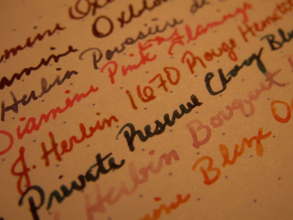
Here is a list written with a dip pen where you can see Rose Rage with a bunch of other reds and pinks. Do keep in mind that these all look very concentrated (and that my writing with said pen is terrible).

Overall, I like this ink pretty well. It behaves and is a fun, bright color. I don't think I'll be using it much this time of year, but it will definitely make it into the rotation come Spring and Summer.
Friday, November 12, 2010
A preview of the inks I will be reviewing
I received a bunch of new inks in the mail today, and I will be reviewing the new ones as they are loaded into my pens. Here is a little taste!

Stay tuned,
Shay.

Stay tuned,
Shay.
Tuesday, November 9, 2010
Exciting things to come!
Just a brief update:
I have many inks coming in the mail this very second! I am anxiously awaiting their arrival! I will also be getting some new paper products and pens as well. If you're so inclined, stay tuned for many more updates to come! Hopefully, I'll have something new for you starving readers of mine (all three or four of you) by this weekend.
Ciao,
Shay.
Saturday, October 30, 2010
Private Reserve Burgundy Mist Fountain Pen Ink
This is a bit more appropriate for the fall season, no?
I received this ink in a shipment with PR Blue Suede and a much needed Lamy Medium nib, so it was kind of hard for this ink to stand out from the get-go. I was a bit more excited about Blue Suede for some reason... not sure why, exactly. Maybe it was because I had a "need" in mind I wanted to fill. You see, I get an idea of a shade I "need" in my head, then I have to fulfill it. Blue Suede was intended to be my "peacock blue-green" color. I just ordered Burgundy Mist because I thought I had a pretty good idea of what it would really look like, and I liked that color. It came through for me, which was very nice, after the Black Cherry disappointment.
This color really reminds me of light shining through a glass of grape juice. I would guess the color of burgundy wine is not far off from that, though I wouldn't know, as I only enjoy cheap wine that tastes like grape juice. That's another post, for a later date. The ink seems a touch lighter to me on Rhodia paper than in my journal (which is a cheapish ring bound flip-top notepad from Target). The scan looks pretty accurate, just lighter than what I am seeing in person. This is probably because it is three o'clock in the morning and thus the lighting isn't the best right now. However...the color of the Pink Varsity comparison is way off in the scan from what I see in person. I dabbled in color correction again, to no avail. You'll just have to look at all the examples and get an average expectation if you are considering purchasing this ink.
Would I buy it again? Yep, I liked Burgundy Mist alright from the start, but with more use it has continued to grow on me and now I really love it!
Shay.
I received this ink in a shipment with PR Blue Suede and a much needed Lamy Medium nib, so it was kind of hard for this ink to stand out from the get-go. I was a bit more excited about Blue Suede for some reason... not sure why, exactly. Maybe it was because I had a "need" in mind I wanted to fill. You see, I get an idea of a shade I "need" in my head, then I have to fulfill it. Blue Suede was intended to be my "peacock blue-green" color. I just ordered Burgundy Mist because I thought I had a pretty good idea of what it would really look like, and I liked that color. It came through for me, which was very nice, after the Black Cherry disappointment.
This color really reminds me of light shining through a glass of grape juice. I would guess the color of burgundy wine is not far off from that, though I wouldn't know, as I only enjoy cheap wine that tastes like grape juice. That's another post, for a later date. The ink seems a touch lighter to me on Rhodia paper than in my journal (which is a cheapish ring bound flip-top notepad from Target). The scan looks pretty accurate, just lighter than what I am seeing in person. This is probably because it is three o'clock in the morning and thus the lighting isn't the best right now. However...the color of the Pink Varsity comparison is way off in the scan from what I see in person. I dabbled in color correction again, to no avail. You'll just have to look at all the examples and get an average expectation if you are considering purchasing this ink.

Would I buy it again? Yep, I liked Burgundy Mist alright from the start, but with more use it has continued to grow on me and now I really love it!
Shay.
Friday, October 29, 2010
J. Herbin Bleu Pervenche Fountain Pen Ink
I am not going to be saying much about this ink that hasn't been said before.
This a very pretty color. The hue reminds me of what I would want a Caribbean beachfront view to look like. The shading is gorgeous, to me it looks like the ink tends to "pool" on the lower half of letters. That may be due to the pen/nib, or the way I write, but I feel it gives a very pleasing effect. It makes me think of the gradient of colors you see as tropical waters get deeper. Bleu Pervenche made me want a pina colada with a float of blue curacao on the top of it! A very pretty color for summer, which is probably when I will ink up with it again, as I am a strong believer in seasonal palettes.
Would I buy it again? Yes, but probably with a more specific intent in mind, rather than as a staple ink.
Shay.
This a very pretty color. The hue reminds me of what I would want a Caribbean beachfront view to look like. The shading is gorgeous, to me it looks like the ink tends to "pool" on the lower half of letters. That may be due to the pen/nib, or the way I write, but I feel it gives a very pleasing effect. It makes me think of the gradient of colors you see as tropical waters get deeper. Bleu Pervenche made me want a pina colada with a float of blue curacao on the top of it! A very pretty color for summer, which is probably when I will ink up with it again, as I am a strong believer in seasonal palettes.
Would I buy it again? Yes, but probably with a more specific intent in mind, rather than as a staple ink.

Shay.
Thursday, October 28, 2010
Private Reserve Blue Suede Fountain Pen Ink
I wish Private Reserve would rename this ink. First of all, I think it is kind of misleading. This looks much more green to me in person than blue. Yes, it is a hardy teal, but if I had to put it under a "blue" or "green" category, I would go with green. Secondly, I have an irrational fear of Elvis, and I don't like to be reminded of that. I had a nightmare about him when I was little that he kidnapped me and my dead grandfather had to come to my rescue. I know, I know...I've got issues.
Anyway, I think this is a lovely color. Teal is right up there when it comes to my favorite hues, and it seems to have been quite popular this year. I have several articles of clothing that are almost this exact color. It is nice to write with, but so far I have only had it in a Lamy Safari with a 1.1 italic nib. It shades very nicely, and although my "technical" dry time test went up to twenty seconds before a "dry" result, it doesn't seem to take that long at all when actually writing. In fairness, the "1"'s on my ten and fifteen were pretty wet. It is no where near waterproof, but I have seen worse. There is no bleedthrough on the Rhodia paper, and even the Varsity comparisons bled through a tiny bit. I will add that I think the scan seems just a tick or two lighter than what I see in person, and a little less green than what I pick up on as well. I tried to correct it a bit, but that seemed to make things worse rather than better. Overall, I think it is a decent enough idea of what it really looks like. Would I buy it again? Yes!
Tada!:

May your ink flow freely and the stains wash off your hands,
Shay.
Wednesday, October 27, 2010
Private Reserve Black Cherry Fountain Pen Ink
This will be pretty short. I have had lots of personal drama, and I am just now starting to feel a bit more like myself again. I don't think anyone reads this, or cares too much about my opinion of writing instruments and the like, but I do it anyway. I'm stubborn like that.


I think these scans come off a tad bit more red than they look in person.
Oh well,
Shay.
I had pretty high hopes for this ink. I've mentioned before that I'm a big fan of dark red inks. Come to think of it, I like dark inks in general, as long as they have color. Doesn't make much sense does it? Oh well, I never claimed to, but I digress.
I wanted a dark red, a crimson reminiscent of blood, perhaps not as bright. Much to my chagrin, Black Cherry was way too brown, not at all like what I wanted. Turns out, I should have looked into the color more before I bought it. Due to my disappointment, I think I will be a little too neurotic when picking out future ink colors. The color is a more natural take on the true color of a black cherry, I think. I could be wrong, because the only kind of cherry I really like to eat is of the Maraschino persuasion. I found it to be more brownish on Rhodia paper than the crappy paper I use for initial testing. The ink shaded nicely, and I'm sure if you want a brownish-red, earthy color, this would be right up your alley. Unfortunately for me, I just don't like it, and I'll probably never use it again.
Here are the samples, both done in a Lamy Safari, a fine nib and a 1.5 calligraphy/italic. The fine nib sample was done on aforementioned crappy paper.


I think these scans come off a tad bit more red than they look in person.
Oh well,
Shay.
Monday, October 18, 2010
Private Reserve Ebony Purple Fountain Pen Ink
I like purple. It has a lot of different shades, and can evoke many different emotions. I definitely wanted a purple ink for this time of year. Everyone knows: jewel tones are always "in" in fall. After some personal medical and educational drama, I decided to finally treat myself to some real inks, and a converter for my Lamy Safari, that way I could use them. The first two inks I received from JetPens were J. Herbin Bleu Myosotis (a kind of denim color) and Private Reserve Black Cherry. I was underwhelmed by both of them, and I only ordered them because they didn't have one single interesting purple in stock. In a desperate search to quench my purple needs, I ordered two more inks from The Goulet Pen Company. From those fine folks, I received Private Reserve Ebony Purple and J. Herbin Bleu Pervenche. I'll have more on the other three inks later; for now it's all about the Ebony Purple.
Some ink names can be misleading, others can be downright out of left field. Such is not the case with Ebony Purple. It is exactly what it claims to be: purple so dark, it's almost black. It could easily be mistaken for black if viewed in certain conditions. I kind of like that about it. You could probably get away with using this in a professional or academic setting where blue or black ink is all that is really accepted. The darkness is greatly dependent on how saturated the line you are putting down is. The swab from a q-tip doesn't look black at all. It's kind of deep lavender, I'm guessing it looks quite similar to Caran d'Ache Storm or J. Herbin Poussiere de Lune. Here is my swab swatch:

Coming out of a pen nib, it is a different story. It is much darker under artificial light than in natural. It pretty much looks black this time of night while illuminated only by my desk lamp. Natural light brings out the purple much more, but it is still pretty dark. I think the scans are relatively accurate though the shading is much more pronounced in the scan. It's a nice writer, neither too wet nor too dry. Flow is nice. My 50ml bottle was $8.25 (before shipping) from The Goulet Pen Company. I definitely like this ink a lot and I will reorder more when I run out. Here is my written review:

On a side note: I am not affiliated with nor compensated by JetPens or The Goulet Pen Company. I found both of them to be very nice to buy from, and shipping was very fast from both (JetPens came form CA, Goulet order came from VA, and both arrived 3 business days after placing my order). The Goulet Pen Company added a handwritten note to me on my invoice and included some swatches of other inks, for my own future reference. I found Brian Goulet's personal touches quite endearing. I will be ordering from both companies in the future!
Shay.
Wednesday, October 13, 2010
Semi-personal Update.
It has been quite sometime since Nick or myself have posted anything on here. For the NONE of you that read this, I feel the obligation to explain.
At first, I was gearing up to start school for nursing. I was due to begin my journey to pill-jockey-dom on October 4th. Exactly one week before, I began having a funny pain in my back. It turned out to be, as I had feared, a kidney stone. Once again, I'm taken out by my own body.
SO basically, I've been trying to take care of that ever since. We've been busy, and poor (more than usual). Things are beginning to look up, and I have surgery to hopefully finally get rid of this rock inside me tomorrow morning. I decided to be a Social Worker when I grown up, instead of a nurse. I am in the process of trying to get accepted to Northern Kentucky University so I can do that. I also have a new order of writing implements coming from JetPens. Once I am up and running and have some reviews and or news to share with all of you, I will do so post-haste!
Shay.
Monday, September 20, 2010
A few thoughts on food (particularly deviled eggs).
So I was making some of my (kind of) famous deviled eggs recently, and I had some thoughts I felt might be worth sharing. That sounds narcissistic but I don't mean it that way at all.
I don't know how many times Nick and I have had conversations about how peoples' number one mistake in cooking is over-complicating things in an effort to make them better.
As I mentioned before, my deviled eggs are (kind of) famous. It is probably the only thing I am ever asked to contribute to family functions, but I am happy to do so. Now, I don't fancy myself a gourmet in any sense of the word, but I do make pretty damn good deviled eggs. People have apparently tried to replicate their awesomeness without luck.
I don't have any secret ingredient.
The only secret about my deviled eggs is that there is no secret.
I will say that blending your filling mixture with an immersion blender makes ALL the difference, but as for the ingredients of said mixture, I use five, and ONLY five. Boiled egg yolks, mayonnaise, mustard, salt, and pepper. I have been deviling eggs since I was a wee girl trying to help my mom prepare holiday meals. I have perfected the craft and have been doing it the same way for years. I have never and will never use a recipe. I always make different amounts of eggs, and the eggs are not always the same size, though I do prefer Extra Large or Jumbos. I can tell a lot about the flavor by the texture and consistency of the filling, but I still taste it. I cannot stress enough how important this step is. Why would you feed something to people without first tasting it to see if it is any good? That just doesn't make sense. If you are making something that you cannot taste due to raw ingredients, try and get everything together that you can taste before adding anything that must be cooked. Tuna patties come to mind. I use egg as a binder, but I taste and make sure everything tastes good before I put the eggs in.
Now, back to the deviled eggs, I use MAYONNAISE... not Miracle Whip. This is important in the flavor profile I like in my satanic ovum. The mayo must be cold or it will separate, especially if you subject it to an immersion blender. As Alton Brown says, that makes it NOT good eats. Also, I put enough mayo in to clog an artery or five, but that's why they are good people! I don't use any vinegar, relish, sugar, or anything else weird. Maybe that's what you're into but I am not.
I like things simple and delicious. I am not a food snob, and I can appreciate fine cuisine, but sometimes a chick just needs some McDonalds french fries. I think there can be artistry in all cooking, whether it be hamburger helper or five-star french fare. You can really spruce up a 'Helper and you can really mess up simple things. The worst cooks are those who follow recipes and never learn what they're about. I suppose it's like people who can read music but don't learn how to improvise or come up with anything original.
Just remember this, more ingredients does not mean better taste. Keep it simple, and in the wise words of RuPaul, "Don't f*ck it up".
Shay.
Saturday, September 11, 2010
The Crave Brothers Les Freres Cheese

The Crave Brothers Les Freres is a pasteurized cow's milk cheese from Wisconsin. It is a little stinky, but nowhere near some of the other cheeses I have had. Your hands will smell a little like feet after handling the washed rind, but your taste buds will thank you. I like this cheese much better after it has come to room temperature. As my windows are open and it's kind of humid, that didn't take long today. The smell mellows and the taste and texture improve with the temperature equilibrium. Straight out of the fridge, the soft cheese has a little bit of spring to it, being borderline rubbery but not in an off-putting way. This cheese has a good saltiness to it and it is not overly creamy or rich. For some reason today I am getting a huge cracked-pepper taste from it which I have not noted in the past. It has the acidity of many other soft cheeses I have tried but it doesn't smack you in the face with it or linger on your tongue. This is somewhere between the mild D'Affinois and a salty brie. It doesn't have the mushroomy quality of nice brie, nor does it have the buttery subtlety of D'Affinois. If you like those two cheeses, give this one a shot. My quarter round was $4.92 at the Newport Kroger Marketplace Murray's case, and is labeled as $11.99 a pound. I recommend tasting this on a crispy unleavened wafer (as pictured) or a slice of crusty french or batard bread. 


Happy Eating!
Shay.
(Nearly) The worst of the bunch: The Sakura Gelly Roll Gold Dust

The ONLY reason I purchased as many of these as you see here is because they were not available individually. With the other Gelly Roll pens, I have been able to pick and choose the colors I wanted in any given finish, as well as try them (on my hand if nothing else) in the store before purchase. I thought these looked cool, and they must've been decently priced, though I don't remember how much they were. I am guessing no more than $12. Jeez, I'd really hate myself if it was more than that. So these pens are basically the same premise as the "Metallic" Gelly Rolls, except that in this case, the metal is gold. In saying that, I mean these have gold "dust" or glitter over a colored ink background. If you really like gold, you may like these. Personally, I like silver better. Come to think of it, I really shouldn't have bought these at all, but I'm a pen addict; it's what I do. The colors on these are okay. Just okay. The green looks sort of like oxidizing copper. Maybe that could come in handy for something? The black is probably the only interesting one, but for me it teeters between interesting and ugly, like modern art. The purple looks more like mauve and the pink looks like a salmon color to me. With gold. If the Golden Girls had a line of gel pens, I think this would be the perfect palette. I could see Blanche Devereaux sending lurid love letters to younger men written in one of these inks on paper spritzed with Jean Nate. Alright, so the colors are kind of ugly. That pales in comparison to how terribly they write. Oh my gosh. The ink in these things is horrible! Not only is it globby and kind of sticky or oily or something... it smells! There is something in these things that causes little strings of ink to follow the pen from line to line. It is a lot like an old ballpoint pen when it hasn't been used in years and is all gummed up when you restart it. The only difference is that these pens are always like that. I don't like these pens and I wish I hadn't bought them. That's just about all there is to it.

Shay.
Sakura Gelly Roll "Metallics"

I have owned these pens before, in the same colors even. I remember liking them a lot. I don't know if I had finer-tipped versions, if there even ever was such a thing. Maybe I was just more easily impressed then. These pens aren't horrible, and I'm sure they'd come in handy for scrapbooking. The problem is, I don't scrapbook. I journal, and doodle, and make lists. Sometimes, I write in my planner. I like pretty pens, and I like unusual pens. I like neat-o colors. That doesn't mean I throw form and function to the wind. I'm not the type to wear a pair of shoes because they're cute if they give me blisters. I like a happy compromise. As much as I want to, I'm not quite getting that from these Gellies. The colors are good, and as advertised: metallic versions of purple, blue, and black. The black ends up more of a dark silver/gunmetal color though. The ink flow on these is WAY too generous. I'd go so far as to say soupy. Goopy. Globby. Just plain yuck. These colors would be good if you could read what you had been writing. These are nice to have around, but I don't know what I'll really use them for. I purchased these individually a while back at Michael's. 

Shay.
We had the good, now the bad. Foray Liquid Medium Turquoise
This pen has to be one of the most disappointing ones I've purchased since really getting back into pens earlier this year. I bought this at Office Depot, and I don't know if this is "their" brand or what, but this pen just plain sucks. It is a liquid rollerball with a medium (.7mm) tip, so it should have a nice consistent ink flow. It most certainly has no such thing. I had tried one out in the store and like it, which is why I bought this dud in the first place. Now, I will say, this is a rather attractive pen. It has a very nice feel in the hand. It has a "heft" that makes it feel like it is going to be a much nicer writing implement than it is. Deceptive minx! The color is typical of a turquoise liquid ink. Not bad, but not extraordinary either. The ink flow skips something fierce, and there is just nothing else to make up for it. The grip is slick and hard to hold on to. I can imagine this being a real problem if I could stand writing with this long enough for my fingers to fatigue and sweat a little. I bought it individually at Office Depot, and while I can't remember for how much, I assure you it was overpriced. This is the kind of pen that if I had stolen it from a friend based on promising looks, I would "remember" I had borrowed it and give it back. The writing sample doesn't do justice to how poorly it performs (it behaved a lot better than usual today). 

Shay.
Friday, September 10, 2010
Sanford Uni-Ball Gel Grip Medium Burgundy

This one is a little bittersweet for me. I absolutely LOVE, let me say that again, LOVE the color of this pen! The writing experience, however, could be better. The tip is fine for a medium point, and I am guessing it would be a .5mm. In my experience, that's a fine point, some would say extra-fine but I think that's a stretch. That said, this pen does scratch and skip. I find it kind of annoying, but it's not enough to keep me from using it as the color makes up where it lacks smoothness. Unlike a lot of "craft" gel pens, this one actually has a rubber grip, which is another positive in my eyes. The ink color is a perfect middle point between dark red and dark purple. I love both colors, so it doesn't get much better. I am drawn to dark red pens, but I often find them a brownish brick color, and I don't like that at all. This one was amongst today's Michael's plunder. At $1.79, it is more expensive than a Gelly Roll, but it seems to have a thicker ink cartridge, so hopefully it will last for a while. A little tweaking by Uni and this would be a show-stopper in my book. 

Shay.
ps- I realize now I spelled burgundy wrong, so sue me. I spell grey wrong too, cuz I'm edgy.
Sakura Gelly Roll Fine Purple Gel Pen

This was picked up at Michael's today as well. I was looking for the same pen, but in Royal Blue to replace one I have that is dying. They didn't have that color, so purple it is! The Fine point Gelly Roll pens are sooo much nicer than their bolder counterparts. They lay down nice, clean, smooth lines. They are not scratchy on the paper, and they just look so nice. The only way to improve them would be a better grip and perhaps the option of retract-ability. I loves me some retractable pens. The purple color of this pen is a dark bluish purple without any pinkish or red tones to it. Very nice and royal looking. I'm pleased with this Gelly Roll as well. 

Happy writing,
Shay.
Subscribe to:
Posts (Atom)